The Famous Logos with Hidden Messages
The “Keep it simple” rule dominates the world of design for many years in a row. So it’s pretty obvious, why startuppers and burgeoning entrepreneurs are willing to pay thousands of dollars to get that “clean and elegant” logo. But what differs a “good simple” from the “perfect simple” is an element of surprise that makes the audience go “Wow!”. Today we’ll show you 10 most famous logos with hidden meanings and will tell you how your startup or business can benefit from using the same techniques.

FedEx
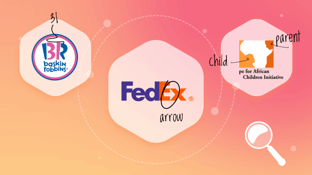
It might take you some time to find a hidden meaning in FedEx logo. At first sight it’s a simple wordmark, the most basic font is used, and there’s nothing special about it. But that’s a misconception, an illusion created by a professional designer. Look at the space between E and X. It forms an arrow. It may seem like a minor detail but this arrow adds some “flavour” to the clean design and symbolizes the onward movement, speed, and determination. Exactly what you want from a delivery company.
The lesson: Your logo can be simple and meaningful at the same time. Try to work with what you have and don’t overwhelm the customer with irrelevant details.
Baskin-Robbins
One of the most famous and loved ice-cream shops in the world is obligated to have a logo with some magic in it. And Baskin-Robbins definitely has it. The clever use of two colors and the negative space makes the Baskin-Robbins logo a “double threat”. It displays not only iconic B and R letters but also a number 31. It’s a signature number for Baskin-Robbins as this chain offers 31 flavour of ice-cream (one flavour for each day in the month).
The lesson: Think of a symbol that will make your brand stand out and make it a part of your corporate logo. It can be something you’re proud of, your talisman or something that inspires you.
Hope for African Children Initiative
HACI deserves this truly brilliant logo design. Two shades of orange (the hues traditionally associated with the heat, desert, optimism, and life) form a negative space where you’ll see the shape of the African continent and a child looking up at his mother.
The lesson: Don’t neglect the negative space. This well-known design trick will help you create that “2 for 1 special” effect in your business logo.

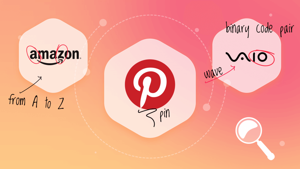
Pinterest is also known for having a deceptively simple logo, which doesn’t seem to have any hidden meanings. Nevertheless, Pinterest’s team has managed to create a one letter logo with the hidden meaning. The trick is the stylized capital P looks a lot like a pin. And Pinterest is all about pins isn’t it?
The lesson: Unique decorative fonts can turn even one letter into a masterpiece. Explore different kinds of typefaces and don’t be afraid to experiment.
Amazon
When talking about hidden messages in logos, we can’t but mention Amazon. The company not only is known for a “double meaning” logo but also has several fan-made slogans for it: “From A to Z with a smile” or “From A to Z Amazon has it all.. And a smile”.
Originally the “smile” connecting letters A and Z in the company’s name was added to emphasize the fact that Amazon is willing to deliver “anything anywhere”. A clever marketing trick.
The lesson: Create a story behind the hidden meaning. Don’t use it just because logos with several meanings are trendy or because you just want to stand out. Make the hidden meaning work in your brand’s favor.
Vaio
Vaio is the electronics brand from Sony. And the greatest thing about its corporate logo is that the hidden message represents the dynamic duo of analog and digital types of technology. The first two letters (V and A) look like the analog wave. I and O form the binary code pair.
The lesson: Let the hidden meaning incorporated in your logo correlate with your business industry or product specifics. It doesn’t always have to be about something abstract.

Sun Microsystems
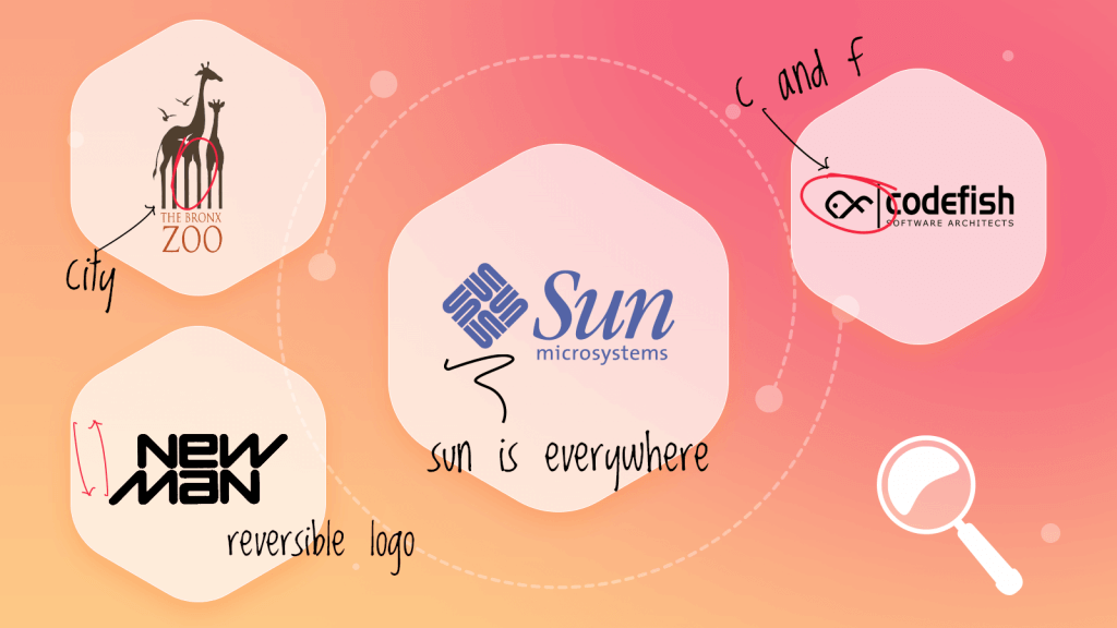
Sun Microsystems’ logo isn’t so much about the hidden meaning. It’s about the clever resource management. The logo consists of a classic word mark and a decorative element (a square made out of 3 letters “S”, “U”, and “N”). It not only complements the wordmark but can be used as a favicon or an icon for social media profiles.
The lesson: Get creative with your business name. Try to rotate or invert letters (or even whole words) to make the business logo look cool and unique. And don’t forget about how your logo will look not only on your website but also on other digital platforms.
Bronx Zoo
When elegant meets modern. Bronx Zoo logo has a sleek minimalistic design and the classic dark and white combination creates a perfect field for design experiments with the negative space.
At first glance you notice birds and giraffes. But when you look closer you notice the iconic New York skyscrapers. The animal kingdom in the city jungle!
The lesson: If not sure about the color, go for the dark and white logo. Such a combination makes it easier for the customer to find the hidden details in your business logo.
Codefish
Codefish has changed the corporate logo several times but every design was a perfect representation of what the company’s doing (software development). Look at these beautiful fishes! The first one is made out of the symbols developers use while coding. The second one is formed by letters C and F.
The lesson: Even the cleverest and the most beautiful logos need to be revamped one day. Don’t be afraid to go for something new. Your ability to keep up with the design trends will attract new clients and will be a pleasant surprise for the established customers.
New Man
This logo belongs in the Business Logo Design Hall of Fame as it was created in 1969 and is one of the first ever commercial reversible logos. Which means, if the customer turns it upside down, the logo won’t change and (s)he still will be able to read it.
The lesson: Think outside the box. Try the “reverse” technique (especially if your brand name consists of two words). Experimenting with different fonts can help you achieve the result.
