Email Marketing For Beginner Entrepreneurs
A few years ago at Sherpa Summit, I heard MECLABS founder and CEO Flint McLaughlin tell the crowded hall that there were no expert marketers. There were only marketers with more experience than others.
So, take solace in remembering that we all have to start somewhere. Besides, email marketing provides the data and feedback to help you learn as you go and continuously improve your efforts.
Before we get into where to start, let’s talk about why you should be be doing email marketing to begin with.
Why Do Email Marketing?
The numbers in favor of email are staggering.
It’s estimated that we’ll see nearly 3 billion email users across the globe by 2019. Not only that, but there are more than 100 billion emails sent every day. That number is predicted to grow to almost 250 billion by 2020.
If that isn’t enough for you to get started, here are five more reasons you should be doing email marketing:
- It’s cost effective. Email marketing is one of the most affordable solutions available to businesses today.
- It’s quick. Thanks to readily available free HTML email templates that can be totally customized to your brand, you can create and send your first email in under 30 minutes.
- It’s targeted. With the help of the data you can collect from email marketing, you can segment your list based on your subscribers interests. That lets you send campaigns that are relevant to their needs every time.
- It’s simple. Thanks to pre-made templates and drag-and-drop editors, the learning curve is pretty low.
- It works. The industry average for Return On Investment is $42 for every $1 spent.
Now you know why. Let’s talk about how.
Getting Started with Email Marketing
Too often, I’ll hear a business owner say that they’re not yet ready for email marketing. They are. They just don’t know it yet.
Every business is ready for email marketing from the moment they buy a domain or create their social media profiles.
So, what’s your first move?
It Begins with a List
You can (and should) start to grow your list as early as possible.
Even if your website isn’t done being built, you can put a signup form that allows people to get updates as the launch of the site or your business nears. It will help build hype and let you hit the ground running.
Upload Your Contacts
Even if you’re new to email marketing, you probably have a list of contacts, customers or leads.
Start with what you’ve got an upload it to your email marketing account. You have to start sending to a list, no matter the size. It will help you learn what will be successful. Hone your skills in front of a smaller audience so you’re ready when things get big.
Build a Signup Form
To get beyond the contacts you already have, it will take a signup form.
When it comes to how your audience wants to hear from you, email takes the cake. 90% will choose to receive an email newsletter. However, only 10% say they want to hear from you on Facebook.
Here’s how to create a great signup form:
- Keep it simple. Don’t overcomplicate things. Ask for only the info you absolutely need. Don’t create any friction or anxiety that would keep someone from subscribing. Remember, you can always get more info later.
- Set expectations. Let potential subscribers know what they have to look forward to. Say what you’ll be sending them and how often.
- Include an effective CTA. There should be no question that a site visitor or social follower has to signup. Create a sense of urgency that lets someone know they’ll be missing out if they don’t subscribe.
- A large button that cannot be missed.
- Red buttons have proven to be most effective. Green works second best.
- Keep it to 40 characters or less.
- Try using 1st-person language such as “me” or “my” to better relate to your audience.
- Mind your brand. When you design your signup form, it’s important to keep your branding as the focus. Don’t choose colors or write copy that doesn’t look or sound like you.
Now let’s talk about where you should be placing your signup form(s).
Obviously, your homepage should have a signup form. Where it lives on that page can vary.
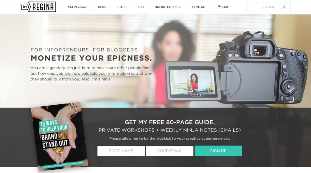
Some include it in the hero image, above the fold. This truly helps to grow your list quickly.
The signup form on the homepage for by Regina cannot be missed. The fact that it includes an incentive to signup helps as well.
Other sites include a signup form in their sidebar or the footer of their page. If you choose your sidebar, keep it near the top. The further down it goes, the fewer signups you’ll amass.
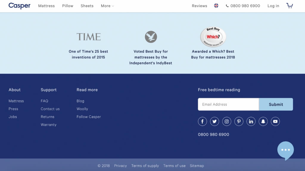
If you opt for the footer (an idea counterintuitive to the one above) you may receive fewer emails. However, if a site visitor makes it to the bottom of your page you know they’re interested. It makes for high quality subscribers.
Casper understands you’re not there to signup for emails. That is unless you’re doing research and want some more information. Saying “Free bedtime reading” copy is on brand as well.
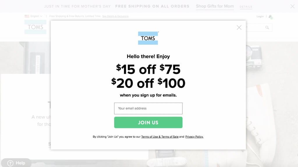
If your goal is to command attention, and you want to make sure your form cannot be missed, a pop-up signup form is your best bet.
This opportunity for savings from TOMS grabs your attention with the pop-up. The CTA of “Join Us” is another nice touch. It doesn’t sound as high stakes as signup for subscribe. It sounds more like you’re assisting them for their cause.
You should also consider including a signup form here:
- Your blog. Maybe it’s a seperate list that only sends blog updates.
- Facebook page. Your social followers aren’t always your customers or subscribers. Fix that.
- About Us page. This is one of the most trafficked sites for most businesses. Take advantage of that fact.
- That little bar across the top of your site. Some sites have created a top bar on the homepage or other pages. You can try Hello Bar or ViperBar for this.
Create Your Email
As we mentioned before, there are many templates available to marketers today. Drag-and-drop editors also make it very simple to customize a design. That makes it simple, but it also presents challenges when trying to maintain your brand.
Here’s how you can create a great email that stays true to your brand:
Design
The user experience should be the same from your website, to social media and your emails. That means a consistent look and feel.
Yes, your logo should be in every email campaign you send. That’s just the start. It could also mean recreating your website navigation within the design of your email campaign.
Even for special email promos for holidays or otherwise, you need to be mindful not to change things up too much.
There should never be any doubt as to who is sending your emails when a subscriber opens it.
Deliver on Your Promise
You said what you’d be sending them in your signup form. That’s just the first part. The rest is staying true to the mission statement of your company.
The same way you’d speak to a customer who walks into your brick and mortar or who calls you on the phone or talks to you via chat is the same way you should write your emails.
The voice in your email content should have the personality of your brand throughout. It must always remain authentically you.
Achieve Your Goal
There should never be a question as to why you’re sending an email. Each entry to your subscribers inbox should land with purpose. If you know the goal of your email, it’s easy to work your way backwards to achieve it.
What content must be included to convert on your goal? Is there a clear CTA that will lead them to it? Is there anything that might distract from your goal?
These are the questions you must ask yourself before you hit send.
Send with Confidence
If you’ve followed the advice in this post, you should be well on your way to email marketing success.
You’ll be sending to your core customers or the leads who are like them and growing your list the right way.
Plus, you’ll be capturing new subscribers at every possible touchpoint.
Your email campaigns will also be on brand and designed to achieve your goals.
All that will remain will be learning how to understand your email reports and see what you can improve upon for your next email campaigns.
Share Your Tips
Are there lessons you learned as a new email marketer? Share your tips in the comments section!
Feel free to ask any questions that you may have as well.
Bio: Andy Shore has spent nearly a decade gaining experience in email marketing and sharing it with the readers of the Benchmark Blog. He also created the web series Ask Andy, which stars a cartoon version of himself. Despite being a cartoon, he somehow manages to be taken seriously by many of his readers … and few of his coworkers.
