
Why logo revamps are necessary? UPS case study
One of the greatest misconceptions about the corporate logo design is assuming a beautiful effective and well-known logo will work still remain powerful with the course of time and will never need replacement or changes. Sure, there’s a saying: “If it ain’t broke, don’t fix it!”. However, in the business logo design world it doesn’t really work and to keep your company on top you need to tweak your corporate logo every once in a while just to keep up with the times.
Many iconic brands got through this. UPS is one of them. This brand’s success story will show you that changes are good for your business and will inspire you to get your business logo a life-changing makeover.
What is UPS and why does it’s logo design even matter?
UPS history begins in 1907 and since that time it has managed to grow from a promising startup launched by a 19-year-old to the largest package delivery company in the world, which successfully operates in more than 220 countries. That’s why UPS logo design journey is both distinctive and informative for all the entrepreneurs striving to replicate the company’s success.
Some may wonder what does UPS stand for. It’s actually an acronym for “United Parcel Services”. So the “UPS” meaning is pretty straightforward and is aimed to reflect what the company’s actually doing (which is delivery services).
So, once again, UPS history started in 1907 when the UPS founder James E. Casey launched a messenger service company in Seattle. And even though the company’s present name was adopted only in 1919 (twelve years later), the famous UPS slogan “best service and lowest rates” has never changed.
By 1976 the company not only managed to cover all 48 contiguous states in the USA but also entered the German and Canadian market. And in 1985 the UPS air delivery service connected the USA and six European countries.
In the 90s UPS history has reached a new milestone as the company launched UPS Logistics Group focusing on supply chain management and consulting. And the UPS Capital started to provide the finance and insurance services.
Long story short, UPS history may sound like a Cinderella story for entrepreneurs. From a $100 startup to a multi-billion dollar company. But the greatest thing is that it’s not a fairytale. It’s a real-life story of success. And UPS logo design was a huge part of it.
The evolution of UPS logo
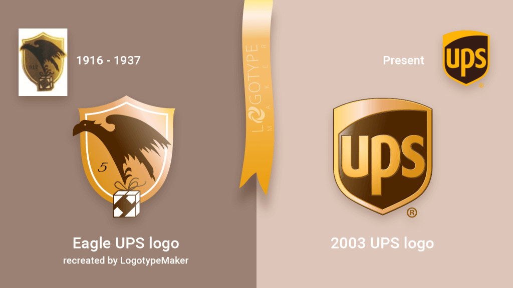
The first corporate logo was created by the UPS founder James E. Casey himself in 1916. It’s an eagle carrying a package, which has a label with a motto “Swift, safe, and sure” against the background of the bronze shield.
Sure, nowadays this design may seem too dark and maybe too complicated. However, it worked for UPS from 1916 to 1937. The great thing about the first UPS logo is that it has all the essential elements in it. It showcases a parcel being delivered (reflects the business specifics), it has the motto including all the brand values, and the famous UPS shield conveys the message of security and professionalism. Just by looking at the business logo the customer feels like: “Ok, this feels safe and trustworthy. My package will definitely be delivered in time and won’t be lost somewhere between Chicago and Las Vegas”.
So, the lesson #1 the UPS logo can teach a virgin entrepreneur is to be clear and pick the logo symbols that will form and strengthen the positive brand image.
In 1937 the company introduced the new updated UPS logo. It had some minor but still super important tweaks.
- The eagle was replaced with a brand name
- “The delivery system for vendors of quality” text was added at the top of the logo
- “Since 1907” was added at the bottom of the logo
All of those changes were aimed to emphasize the company’s growth. UPS wasn’t a promising startup anymore. It secured a foothold in the market and became a force to be reckoned with.
If your business is going through the same phase consider a logo revamp just like UPS did. The first thing you want to do is to make your brand name a part of your business logo. It will give an immediate boost to the market visibility and brand recognition. It may not work for the freshly launched startups when no one knows about your company yet but it sure helps the companies with some business experience.
Again, make sure that your business logo always showcases what you’re doing or offering. In the 30s UPS has started to build strong business relations with retailers and it immediately translated into the corporate logo.
Incorporating the year your company was founded into your business logo is a bold move and if you’re a first-time entrepreneur, it’s probably not for you. But it was a brilliant choice for UPS. The company was around long enough and showing that to the customers definitely adds some extra credibility points.
The lesson #2 the UPS logo can teach you: It’s ok to overgrow your first business logo and it’s ok to change it showcasing your journey.
In 1961 UPS logo has received a drastic change.
The design by the famous Paul Rand followed the global “simple is perfect” trend and was super light and minimalistic. The string-tied parcel element came back crowning the legendary shield with the brand name on it.
In the latter half of the twentieth century, UPS has managed to become not only American but global delivery service provider so using the easy-to-understand symbols (like a package and a shield) instead of the text was a really smart thing to do.
The lesson #3 the UPS logo can teach you: Think strategically. Let your custom logo design be clear and straightforward for anyone who will see it.
The latest version of the UPS logo was introduced in 2003. It’s a signature UPS shield in brown and gold, the colors traditionally associated with this company. The design is still minimalistic but the graphic effects (like added specular highlights) really bring it to life and make the UPS logo look fresh and modern.
UPS has celebrated its 110 birthday in 2017. Everyone knows what kind of services this company’s offering. That’s why UPS no longer needs to use such hints as pictures of packages or the text explanations in its business logo. But keeping the brand identity consistent is still vital. Even for such known market leader as UPS. For this reason the brown + gold color palette or the shield symbol have never actually changed or disappeared. And if you want your logo to succeed, steal a page from UPS’s book.
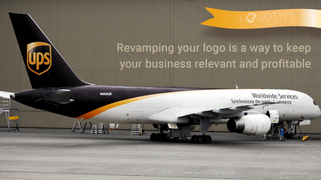
The final and the most important lesson UPS logo can teach you: Changes are good. Revamping your logo is a way to keep your business relevant and profitable. But always double-check your brand identity is coherent and involves several recognizable elements like colors, fonts or symbols.
Well, that’s all good, — you may say — but how can I revamp my business logo and be sure it will make things better? LogotypeMaker is a tool that can help you with that! First of all, sign in and upload your current logo to your personal profile. After that take some time and explore LogotypeMaker’s galleries. You’ll have thousands and thousands of logo templates, icons, and cliparts to choose from and to experiment with.

Incorporate new elements into your current logo via the LogotypeMaker’s user-friendly online logo editor. Change colors or shapes of the whole piece or the separate elements. Add some new text or remove the existing one). Save the unlimited number of logo drafts in your profile and come back to working on them whenever it’s convenient. Buy the new revamped version of your logo only if you like it and feel like the updated design is definitely better.
Dive into logo design experiments. Don’t be afraid to change the logo. The old version may be good but with some work, the new one will be even more effective. Try it today to find yourself amongst the greatest tomorrow!