Apple logo. Cracking the secret behind the success
Apple. No more words needed, right? Even if your first thought is about a fruit, the second one is for sure about iPhone, Mac OS, and the whole Steve Jobs’ empire. No shocker. Apple truly is one of the most famous and valuable brands in the world. The company’s logo is literally everywhere. Even a 5-year old can recognize and draw it. This logo costs tons of money and is one of the brand’s keys to success. But have you ever thought about what makes the picture of a nibbled apple so special? Let’s crack the code! And maybe there will be something you can incorporate into your company’s logo to make it as iconic as Apple’s.
Mini flashback
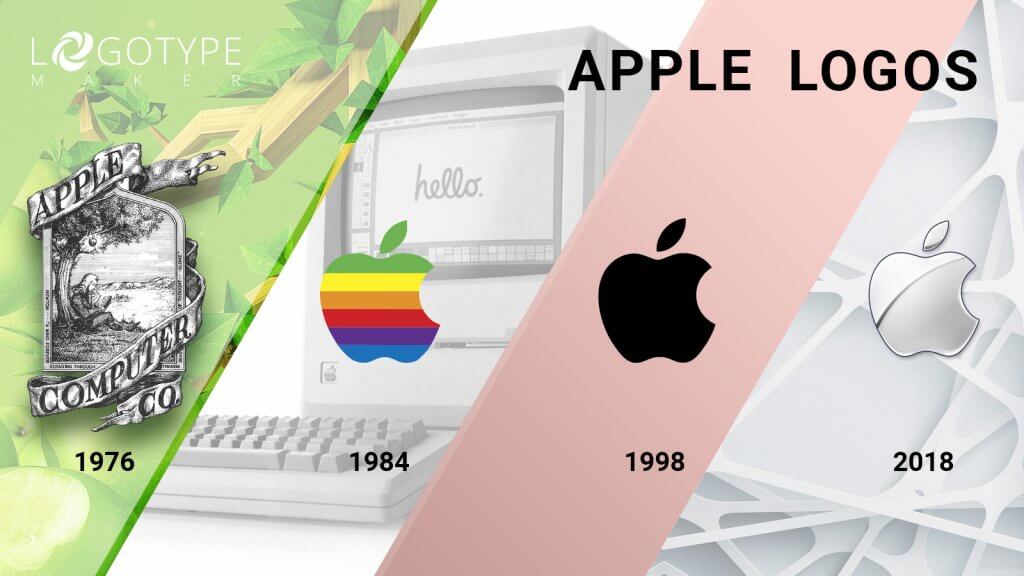
The Apple logo history has so many chapters into it that can become a topic for a separate article. But there are some milestones we just can’t but mention. The original Apple logo actually looked like a painting. It had not only Sir Isaac Newton sitting under the apple tree but also zillions of tiny details that were hard to recreate. No doubt it was beautiful, but soon enough it was clear that the market needs something more elegant and not so complicated.

That’s why in 1977 the “rainbow apple” logo was introduced and became the predecessor of all the future versions including the modern one. It was the year when Apple has chosen to follow the path of meaningful simplicity and refinement. The first rainbow logo combined a silhouette of an apple with a bite taken out of it and a company’s name. It worked for 7 years. But in 1984 the logo became even simpler. Since then and until now it’s only the famous apple. No additional elements whatsoever.
In 1998 the apple became monochromatic and only the colors changed. It was black, aqua, and chrome. And obviously, the minimalism is not going anywhere.
How can I use that? It’s ok to change the company’s logo over the course of time. But if you’re working on your first concept, try to make the logo as simple as possible. Most of the details you may find vital can actually be not so helpful and may not bring more meaning to the brand.
Apple logo design tricks
When creating a company’s logo, many virgin entrepreneurs are tempted to “follow the footsteps of the greatest” and just use the same techniques and know-hows as the world-known brands. But usually, it doesn’t come off that great because no one likes copycats.
However, you still can learn from the Apple’s design experience and use some tricks to create a beautiful logo.
The type of logo
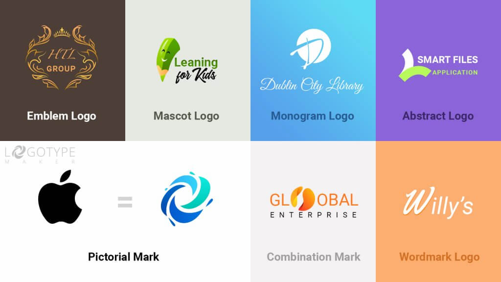
There are 7 different types of logos: emblems, mascots, monograms, pictorial marks, abstract logos, wordmarks, and combination marks. Apple rocks a pictorial mark, which is a styled image of a recognizable object with no text attached to it.
A pictorial mark was a perfect choice for the brand because the early versions of a logo had a company’s name on it and by the time the “picture only” logo was introduced, Apple became a known market player. The brand has gained the recognition needed to proceed to a pictorial mark as a logo.
Yet, if you’re a startuper and only plan to conquer the market, a pictorial mark can be dangerous to use. Nobody knows your company or the product you’re selling and the pictorial mark won’t help people memorize your brand’s name. You need to be 100% sure that the chosen image reflects the message or the emotion you’d like to convey. Only in that case the pictorial mark logo will help you succeed. Otherwise, switch to something more safe like a wordmark or a combination mark.
On the other hand, a pictorial mark is amazing for rebranding. If you need to breathe a new life into your business, do just like Apple did: cut away all the unwanted elements and rely on the power of a picture.

How can I use that? Create a pictorial mark logo to reveal the essence of your brand to the audience. It is perfect if you want to be known worldwide and avoid translation problems (the apple is same in every country). Also, try it for rebranding. Sleek and modern-looking logo never harmed any business.
Color scheme
As you may have noticed, Apple has changed the color of the logo several times. But during the last 20 years, it’s all about monochrome, which only proves the point: “One color logos are effective”.
We admit, at first sight using only one color for the company’s logo may seem boring or not creative enough (especially for people who don’t have much design experience). But virtually monochromatic logos rule the market and the customers love them! Remember Twitter, Nike, Chanel, Toyota, and others?
Just like Apple, you may need some time to find the perfect color. You may do some minor changes from time to time, searching for the right hue. But if a monochromatic look resonates with your brand identity and message, you should definitely give it a try! Besides, one color logos are super trendy right now.
How can I use that? Go to LogotypeMaker’s online logo builder and create several logos experimenting with color. Even if eventually you’ll choose a multi-colored logo as a final version, a monochromatic logo may stand you in good stead some day.
The Brand
No logo can bring you success on its own. It always has a brand attached to it (even if your company is one-week-old). Apple’s logo is so successful not only because it’s simple and elegant. More important than that, it reflects the brand’s values and triggers the right associations.
Right from the start (remember Newton’s painting from the earlier passage?) Apple’s “keywords” were: innovation, creative thinking, individuality, eagerness, and revolutionary ideas. Over the years the “nonconforming” and “out-of-the-box” image of a company only became stronger.
Even the slightest changes to the Apple logo were made for a reason. In XXI century everyone is obsessed with the sleek “cutting-edge” solutions. No rainbow logo could survive this era (especially, if we’re talking about the technology company). That’s why the original “rainbow apple” logo has eventually lost all of the colors to keep up with the time.
How can I use that? Apple is like a chameleon. It changes depending on the company’s needs and the imperative of our time. You should do the same to remain successful. Lock up all of the brand values you want to convey in your logo and modify it when you feel the need to bring something new to your business strategy. If Jobs, Wozniak, and Wayne could do it, you can do that too!
