
Color trends 2019 to dominate the logo design
December is a perfect time for looking back on the year and, of course, making all kinds of predictions. Design industry isn’t an exception, really. So if you’re curious about what’s going to be cool and trendy in 2019, let’s check LogotypeMaker’s crystal ball together and find out!
It’s not red, it’s coral!
Pantone color institute has already announced the color of the year. Living coral will replace the Ultra Violet on the top of the game and will rule 2019. Dramatic, mysterious, and powerful purple was amazing by all means but 2019 is time for warm, energising, and comforting coral.
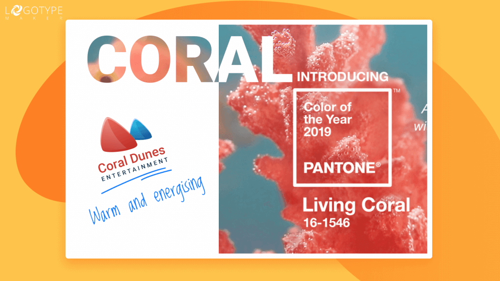
It’s obviously great news for startuppers, small business owners, and all kinds of social initiatives. Coral is not only beautiful and optimistic, it looks amazing on social media and is super easy on the eyes.
If you’re looking for a color that will emphasize the welcoming, reassuring yet modern and bold side of your business, Living Coral is a choice for you! Just look at Airbnb logo or Patreon icon! These brands are known to be great supporters and problem-solvers (that’s why both have millions of loyal customers) and coral in their logo designs only strengthens that feeling.
Show the world the brighter side of your brand and you’ll win in 2019!
Gradients ain’t going nowhere
Yep, it’s almost 2019 and gradients are still dominating the industry. They’ve become popular a couple of years ago and will stay on top for at least another year. But now it’s not about just a simple color transition, it’s about the duotone.
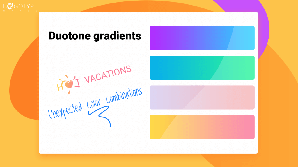
Don’t be intimidated by the wonky design terms! Duotone is actually pretty easy to understand and implement. It’s just two colors combined in one logo (photo, image, poster etc.). But the twist is that duotone uses the half-tones.
Want to see how duotone gradients work? Jump into Spotify and check the playlist covers! Or look at how Adidas, Mailchimp, and evoluir did it.
The magic of duotone will give your website or social media accounts that extra special flair that will help you stand out among the competitors in 2019, so go for it!
And if duotone gradients seem to complicated or just “out of character” for your brand, try more complex, deep, and unexpected color combinations in gradients. To make it easier for you, LogotypeMaker has launched new “Gradient” functionality in our online logo creator. It’s super simple and even the person who had never heard of logo design tools will be able to master it. Try to create a cool trendy gradient logo right now and stay on top of your game all 2019 long!
Go bright or go home
All the muted hues and washed out colors are left far behind. 2019 is a time for bold vivid color choices. Who said that only using pastels and neutrals is a “good taste”? Don’t be afraid to make a statement! That’s how you become eye-catching and noteworthy (which has never been something entrepreneurs try to avoid).
Then again, look at Mailchimp’s homepage, at Americaneagle’s, Cellink’s or Realme’s logos. No color compromise there! Only bright hues that demand attention.
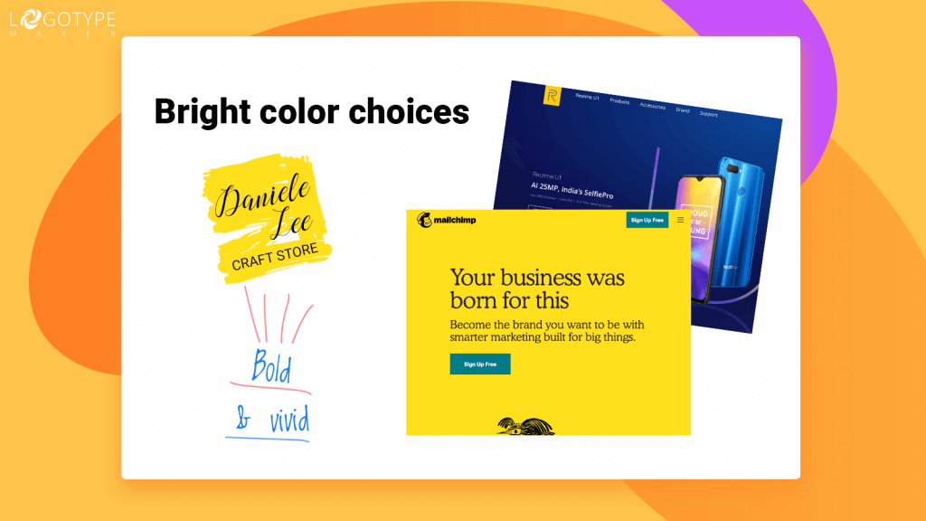
The same trend works not only for web presence or logos but also for packaging. Bold color is definitely a thing to watch in 2019. So, why not try it for your business? No doubt, it deserves as much recognition as the market leaders.
It’s your time to shine!
“What was old is new again”. Metallic effects are back from the ashes and are about to be super trendy in 2019. Not only because that shiny metallic gives your logo a cool futuristic vibe but also because it’s a sure-fire way to make it look expensive, refined, and exclusive.
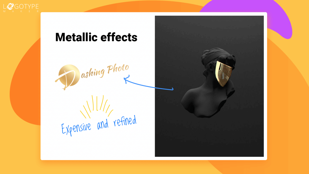
2019 will be the year of golden and iridescent. Even Pantone’s color of the year has golden undertones to it! So, if you’d like your business logo to have that schtick that will elevate the whole brand to a new level, consider adding that metal shine to the design.
BTW, it will look amazing with the gradients! Try it out at our logo creator right now!
Less is… yep, you guessed it
Yeah, yeah, we know… That “less is more” thing seems like the Sunday school truth not a trend. But in 2019 minimalism will be more powerful than ever. The only thing you should remember, it doesn’t mean you’re forced to work only with black & white palette or inescapable pastels again. On the contrary!
Minimalism doesn’t mean boring and it doesn’t clash with the trends mentioned above. It only means you should go easy on the decorative elements, details, and special effects. The colors can (and should!) remain bright, inspiring, and eye-catching.
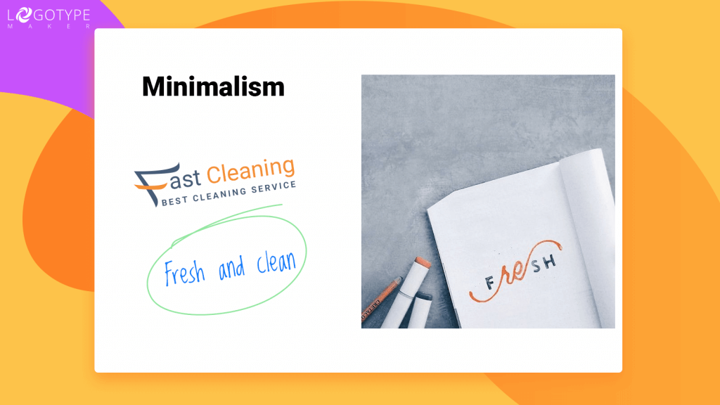
Don’t be afraid to give your logo a chance to “breathe” by cleverly using space. Keep the special effects to a beautiful minimum (metal shine or gradient or glow, not all three at the same time!).
That “fresh and clean” feeling minimalistic designs have is exactly what your brand needs in 2019!