BMW: The Masters of Rebranding
Bayerische Motoren Werke (we all know this brand as BMW) was founded more than a century ago, in 1916. A pretty respectable age for any brand. And, of course, over the years BMW has gathered a huge army of fans all over the world. People love these cars and stay loyal to the brand keeping BMW one of the most profitable automotive companies ever.
But this post isn’t about how awesome BMW is. It’s about the design techniques that helped the company launch several successful rebranding campaigns and the tricks every entrepreneur can use to achieve the same stunning results.
From Rapp to BMW
BMW has a long story with rebranding. In fact, the company’s logo history even began with one. Bayerische Motoren Werke grew from Rapp Motorenwerke, a company known as an aircraft engine manufacturer. However, after the WW1 Germany wasn’t allowed to produce engines (or even parts of engines) for aircraft and BMW quickly switched to vehicle manufacturing.
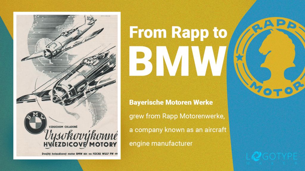
You probably already can see why BMW had to think about rebranding from day one. A “military company” isn’t exactly an association you want to trigger during the postwar period. That’s why BMW corporate logo had to be super neutral and as distant from aircraft as possible. Not an easy design task, right?
Some brands may have chosen to create a logo that would be the very reverse of what Rapp Motorenwerke used to have. BMW, on the contrary, tried to get the most out of the well-known Rapp logo and used it as a base for a new design.
Take a closer look at these two logos and you’ll see that they not only have the same round shape but also the brand names on both designs are in the exact same position.
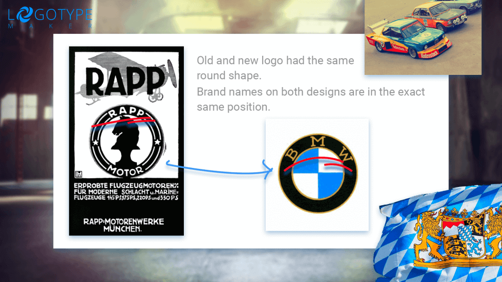
Just by replacing the centrepiece (a black horse was superseded by the colors of the Bavarian flag) and adding some golden accents the company has managed to achieve something that seemed impossible. The first BMW logo was perfectly neutral, modern, and elegant enough to represent a new automotive brand.
What’s the lesson here? If your company is on the eve of rebranding and your new corporate look has to be “better, faster, and stronger” think of all the details that made your logo recognisable and take at least some of them to your new logo design. It can be the shape, the color palette, signature decorative elements, the mascot etc.
Don’t rush to burn all the bridges. Give the audience some hints that will keep the old connections and memories alive. Otherwise you risk to lose that loyal customer base you’ve built for years.
20s to 30s
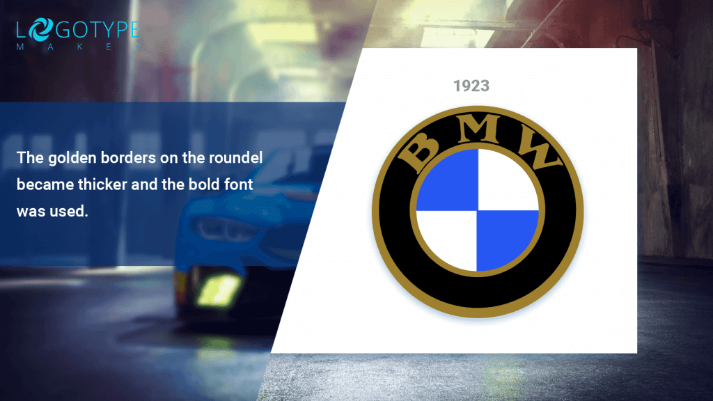
In 1923 BMW introduced the first changes to the company’s initial logo design. The golden borders on the roundel became thicker and the bold font was used. These tweaks may seem minor, however, they helped BMW kill two birds with one stone:
- Being a relatively new automotive brand, BMW required a logo that could grab attention. The new bold design definitely draw the eye.
- The new design resonated with the era. During the “roaring 20s” art deco was the hottest trend. BMW logo with its sleek geometric shape, strong lines, and thick strokes looked fresh and cool.
Just check the 20s logos of BMW’s competitors Mercedes, Fiat and Renault. Look kind of similar, don’t you think?
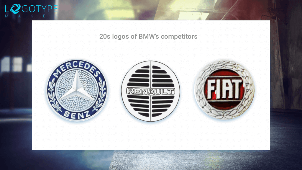
What’s the lesson here? Don’t ever forget that the corporate logo is one of the strongest marketing tools ever created. Use it to get what your business requires. It can be attention, loyalty, awareness etc. Just make sure the logo design is powerful enough and won’t fade to the background in comparison with your competitors’ logos.
Pre-war success
30s are known to be the era of simplicity and heroic realism. In 1936 BMW business logo was revamped once again to keep the corporate identity in line with the call of the times.
BMW wasn’t a market newcomer anymore. In fact, 30s were pretty successful for the brand. In 1933, BMW first launched the legendary 303. And in 1937 the new world speed record was set when Ernst Henne managed to achieve 279.503 km/h on a brand new BMW motorcycle with a supercharger.
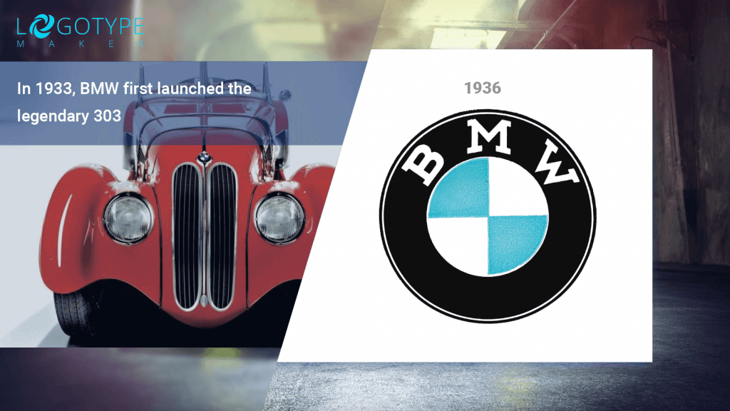
That’s why rebranding was vital. The corporate logo created in 1923 was outdated and didn’t reflect the new BMW status. And once again, the company managed to create a striking new look without having to change the whole logo concept drastically.
In 1936 the new version of BMW logo came out. The new design was more elegant and stylish than ever. The golden hues were replaced by white introducing the three-colored BMW logo as we know it now. The bold serif font remained but the overall design didn’t look over the top because the borders changed the color and became thinner.
At the same time BMW’s competitors were going through the similar process. And interestingly their new logos also became more sharp and minimalistic. Both Fiat and Mercedes gave up on complex decorative elements to tilt toward the simple clean designs.
What’s the lesson here? Compare BMW logos from 1923 and 1936. The chances are you’ll find the 1936 version more attractive. That’s because the “black, white, and blue” is way easier on the eyes than “black, white, blue, and gold”.
The “not more than 3 colors” rule has successfully worked for the logo design for ages. You should stick to it.
Post-war bounce back
After WW2 was over BMW’s brand was in danger once again. The German economy had to deal with the heavy post-war reparations and it couldn’t but influence one of the leading automotive companies in the country.
In 1951 BMW made its first post-war car, which also was company’s first attempt to enter the luxury market. BMW 501 didn’t quite make it to the bestsellers list, however, still helped to reaffirm customers’ faith in BMW as a high-quality brand.
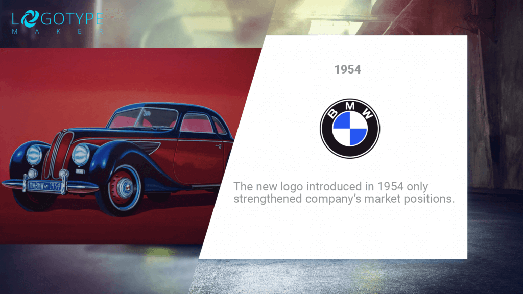
The new logo introduced in 1954 only strengthened company’s market positions. Modern sans-serif font has successfully replaced the more traditional and old-fashioned serif. The white borders became slightly thicker (exactly enough to make the overall design more defined and cohesive). BMW became a force to be reckoned with and the new logo represented confidence and leadership in the best way possible.
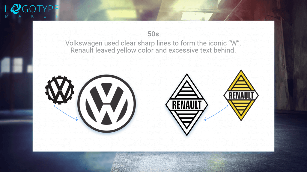
Look how Volkswagen tried to achieve the same effect by using clear sharp lines to form the iconic “W”. Renault also revamped its logo by leaving yellow color and excessive text behind. Strong and sharp designs took over the automotive industry.
What’s the lesson here? Don’t be afraid to change even the most long-living elements of your corporate logo design. The classic serif font never disappeared from BMW logo for almost 40 years! But in 1954 it was eventually replaced and it gave the brand a boost it needed to skyrocket. Remember, thought-out design risks have a tendency to pay off.
The new millenium
When 2000 came many top brands used it as a perfect opportunity for rebranding. The whole “new millenium, new look” thing became viral. BMW wasn’t an exception and no surprise here, really, as the company’s logo hasn’t changed for almost half a century.
The new BMW logo design was introduced in 2000. It combined the chic of 3D effects (which were revolutionary at the time) with the classic beauty of custom Helvetica Neue Bold. The fresh look was both dynamic, elegant, and daring. A perfect combo to enter the new era.
Once again, BMW’s design team was in tune with the latest trends. The same year new BMW logo came up Volkswagen gave its emblem a 3D makeover and in 2004 similar design techniques were used to revamp Renault and Chevrolet logos.
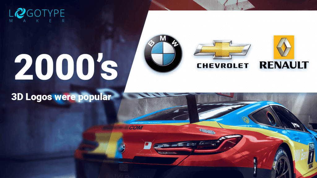
What’s the lesson here? This one may seem the most obvious but it still is super important. Monitor the market changes. Analyze your competitors’ brand identities from time to time. If you can see the global trend coming, ride the wave before the others do it. Otherwise, your brand will be the one left behind.
And if you ever wonder if you can use LogotypeMaker for business rebranding, the answer is yes. Our logo design tool offers the unlimited number of free modifications for every client, so you can revamp your existing business logo as many times as you want! Good luck!
