How to Boost Your Business Using a Clever Landing Page
How to Boost Your Business by Using a Clever Landing Page
Just like the Universe, marketing is endless. And if you’re starting a small business (or run one successfully for quite some time) you know that it’s all about the conversion, turning the random visitors into the loyal customers.
And when you’re starting this war there’s one vital tool you just can’t win without. It’s a clever and professional-looking landing page. Curious to know how to get one without blowing that money off? Well, this post is about to reveal all the secrets.
- Make your logo pop
No matter how simple and elegant your landing page is it still consists of several elements and a corporate logo is one of the milestones you shouldn’t forget about. Usually, landings don’t have many graphic shticks so it’s vital to pay attention to all the logo attributes like the color, fonts, visuals, and the message. Make sure everything looks cohesive and consistent.
Tip #1: Don’t use too many colors. Two or three will be more than enough. And if you’re willing to make the logo look more special spend some time playing with the effects on LogotypeMaker. Use effects like “Drop Shadow” (for the otter shadow) or “Inner Shadow”, make the color gradient or just keep it solid if you want to. Such an approach combined with the minimalistic color choice (2 or 3 shades) will help you to get an elegant and presentable logo.![]()
With LogotypeMaker it’s also super simple to mix the colors in one graphic piece. Just use “Shapes” to change the color or the texture of the particular part and use the dozens of effects the way your imagination tells you to.
Tip#2: Don’t forget about the message! Synergy is the key so don’t use the first available font. If your logo is sharp and graphic use the similar serif font. If the logo is more delicate and playful use sans serif or a fantasy calligraphic font. And don’t overuse the fonts as well as the colors. Two will work! One for the attention grabbers and the other one for the other text parts.
- Get the attention
Why you’re creating a landing page? Write down the idea using just one short sentence or even a couple of words. The headline will be the first thing potential customers will see and read so make sure it keeps the visitor engaged.
It’s always a good idea to make the headline about the profit the visitor will get. It might be about the discount, an exclusive time-sensitive offer or a giveaway. Everybody loves a free ride, remember?
When you come up with a headline test it on several of your friends or colleagues. Does your idea look good to the others? Do they want to buy your product or sign up for that newsletter? Distant eyes never harm anyone.
And then again, use the magic of color or the graphic effects to make your unique headline stand out. Keep’em hooked!
- Work that CTA magic
A call to action button (CTA) is the essence of the landing page. You’ve created the whole thing to make the visitors do something: buy your goods, send an email for your further campaigns, order your service etc. So make sure the CTA button sticks out. 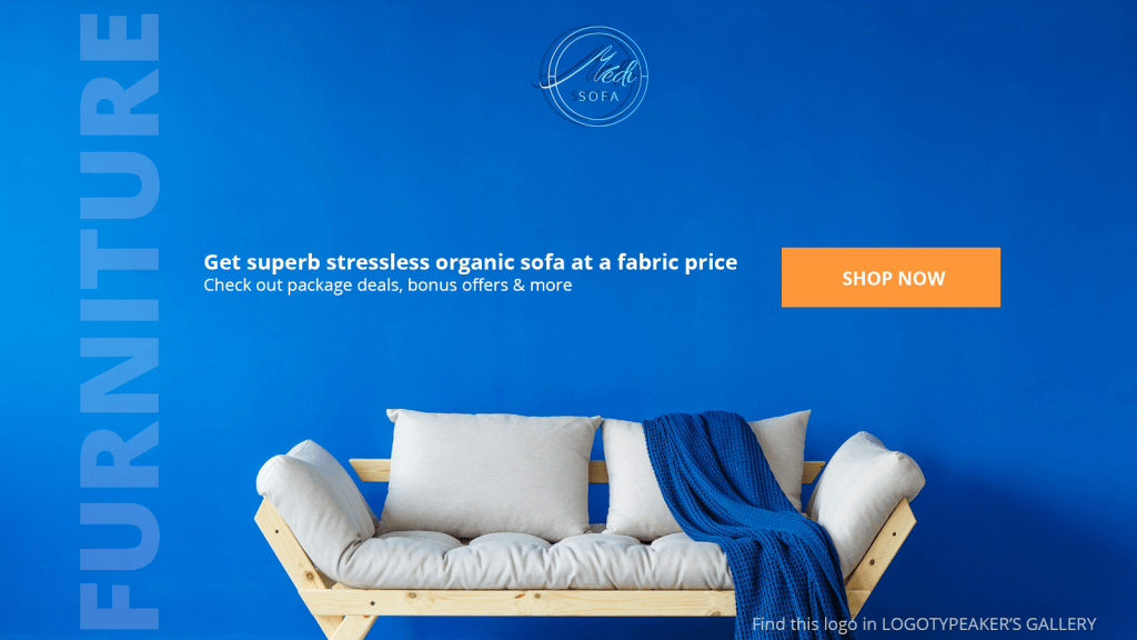
It’s always a good idea to separate it using the color. Choose something vivid and galvanizing into action. Yellow or red is a safe choice but make sure the color works with the whole landing design.
Inner or outer shadow or a frame can also help you separate the CTA button so don’t forget to play with it.
- Keep it clean
A clever landing is always simple to browse. The CTA’s and the attention grabbers are good but don’t confuse the visitor with too many options. Just imagine: you visit the page and you see a giant logo “80% off” and then the blinking “Buy” button, and then the popup appears offering you to leave an email, and then the auto video (or audio) begins to play…. Would you spend a minute browsing that page? Probably you’d click that red cross in the top right corner after the fifth second.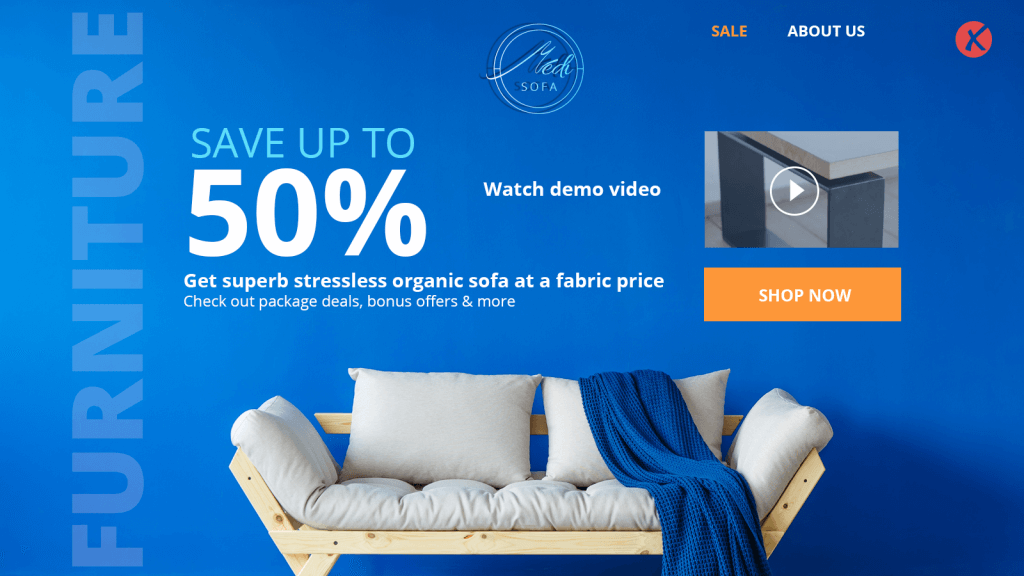
So always remember to keep it clear. Don’t bring on too many CTA’s, confusing content or options. Focus on one desirable action. One visitor = one customer.
- Keep in touch
Don’t forget about the help/contact section on your landing. It shows you care about the customer and not only about them profits. The more ways to contact you the landing offers the better! Don’t use just emails. Leave the phone number or the Skype so that the visitor could contact you immediately.![]()
When the customer feels secure (s)he is more likely to buy that product or service. It’s the key to boosting the ROI and building trust-based customer relations.