
Logo colors to compliment your brand
Like it or not, the colors affect your behavior. You may not notice it but they do. So no wonder all kinds of businesses in every corner of the world get the most out of the color to market their products and make them look better.
The color influences customers via the corporate logos, packaging, shops’ interiors, websites’ design and helps to form and strengthen that perfect brand image, whet the client’s appetite for the product.
The good news is you don’t have to own a multi-million dollar corporation to use the color psychology tricks. In fact, you require two things:
A clear positive brand message you’d like to convey
A color palette that will be in congruence with that brand message
And if you don’t have time to explore and master the color psychology, this article will break it down for you. So by the time you finish reading it, you’ll have a clear vision of what colors to use for your business logo.
Construction
The typical positive brand message for the construction brand accentuates the client’s attention on how trustworthy, sustainable, and professional the company is.
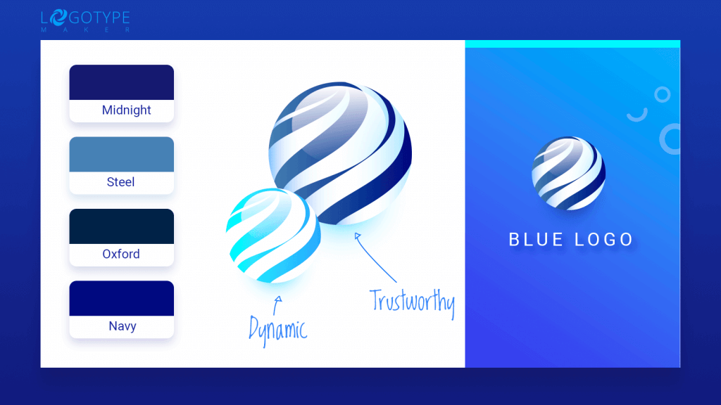
If it sounds like something you want your business to be known for, consider adding deep or muted shades of blue like midnight blue, steel blue, oxford blue or navy to your color palette. Complement the blue hues with darker grey or silver (traditional colors of innovation). Try to use the lighter shade as a background to make the darker hues pop.
On the other hand, if you want your startup to be perceived as dynamic, leading, and competitive, use the red + grey/silver duo.
Insurance Business
If you’re running an insurance company, you know that the key to your success is the customer’s trust. That’s why you want your brand to be reliable, welcoming, qualified, and supportive.
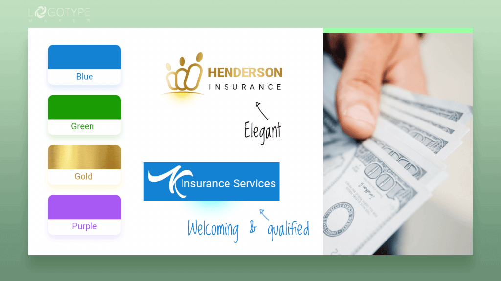
All shades of blue will be a nice thought-out choice for an insurance company logo. Such a color palette will support your brand and make the clients trust you. The blue + white is a classic.
However, if you look at the logos of the top insurance companies, you’ll notice that most of them use blue. If you want to stand out, switch to deep violet, green or gold. Pair up those colors with neutral white to get that elegant look.
Restaurants, Bars, and Cafes
Choosing the perfect color for a restaurant, bar or cafe logo may be tricky as there are lots of factors you need to take into account. First of all, how expensive your place will be? If you want to emphasize the luxurious side of your logo, use either black & white combo or the colors of the precious metals (gold, silver, platinum).
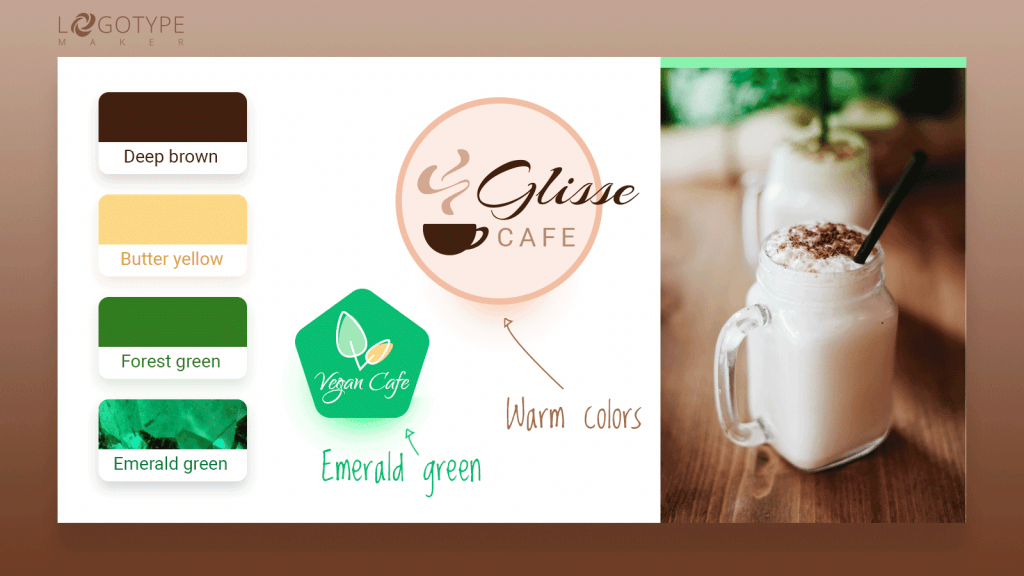
The next thing you should consider is the age of your customers. For the family restaurants use either one vivid color supported by pastels on the background or the warm soothing colors like deep brown, butter yellow or forest green. The younger generation would love bright “call to action” colors like ruby red, magenta, violet or emerald green.
LogotypeMaker’s tip: avoid cool colors in the logo if your business is related to selling food or drinks as those are known to ruin the appetite.
Beauty
When it comes to the beauty business logo, there are three possible scenarios. Your beauty parlor, SPA or a hair salon is either female-oriented, male-oriented or unisex. The logo color should reflect that and send a clear message.
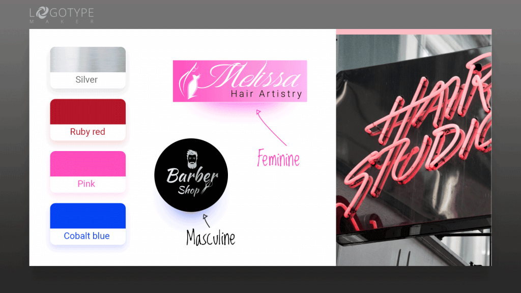
If you’re trying to address women, pick from a wide variety of pastels and add one vivid color as an attention grabber (ruby red, bright pink, azure, orange). The male audience responds well to bright cool colors like cobalt blue, emerald green, silver. And if you want a “one solution fits all” type of logo, go for black and white, grey + white or gold color scheme.
Fitness
Again, the color choice for a fitness logo totally depends on what type of business you have. For a hardcore gym or a Crossfit center use black complemented with the bright active hues like red, orange or violet. However, don’t overuse vivid shades putting them on the background. If you’re willing to create a colored background pick neutrals like black, white or grey.
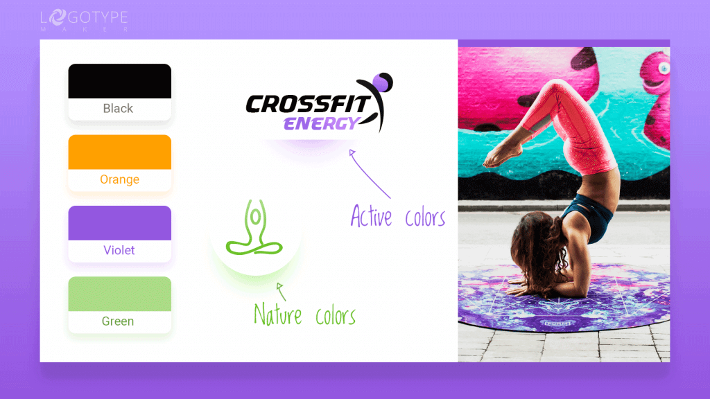
For the yoga, pilates or wellness studios pair up the colors of nature (green, light shades of blue, brown, yellow). Such colors are both inspiring and calming, giving the client that confidence boost.
The business logo for a dance studio can benefit both from cheerful vivid colors like pink, violet, neon blue and soft pastels. When choosing think of the brand message you’d like to convey. Will it be: “cool, modern, freeing” or “classy, elegant, refined”?
Education
If you’re going to launch the educational center, classes or skills workshop decide on soft colors that will make your brand feel approachable and professional at the same time. It can be royal blue, teal, jade green, bronze, carmine.
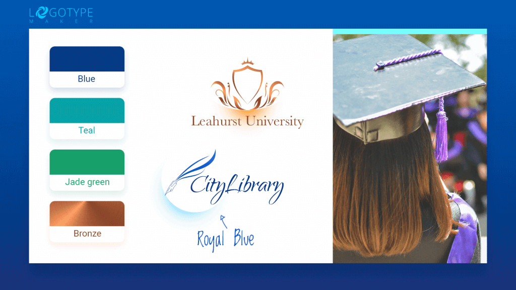
Shades of purple like plum, wine, mulberry will also work as purple is a traditional color of nobility, intuition, and the will to share knowledge.
However, there may be some exceptions. For example, if you want to attract the younger audience (e.g. you’re running a kids educational center) you can combine the colors of the rainbow in your business logo.
Fashion schools, on the other hand, can rock bold colors like scarlet red, bright orange or fuschia.
Consulting
Consulting business is all about the human interaction, so you don’t want to scare the customers away by a super bright or eclectic color choice. You need your brand to be a trustworthy problem solver, so stick to the hues that will trigger those associations. Dark blue, grey, soft green, deep violet, maroon or classic black and white.
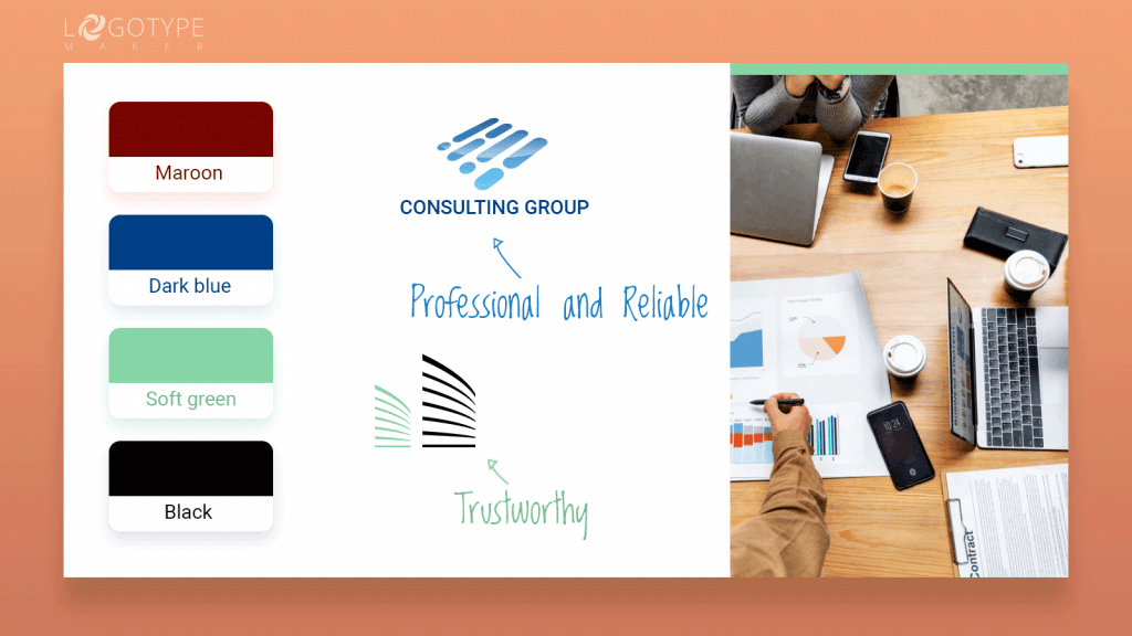
It’s always a good idea to mix a muted base color with the bright accent. Think grey and orange, white and red, green and yellow etc. Colored background is a great option as well.
Experiment with one color logo by adding color gradient it will make your consulting business logo look fresh and modern yet professional and reliable.
Cleaning and Eco-conscious Business
Eco-friendly companies usually go with all kinds of green logos. No surprise here. Green resembles nature and is the easiest color on the eyes. The typical color mix is green and yellow, green and white, and green and blue.
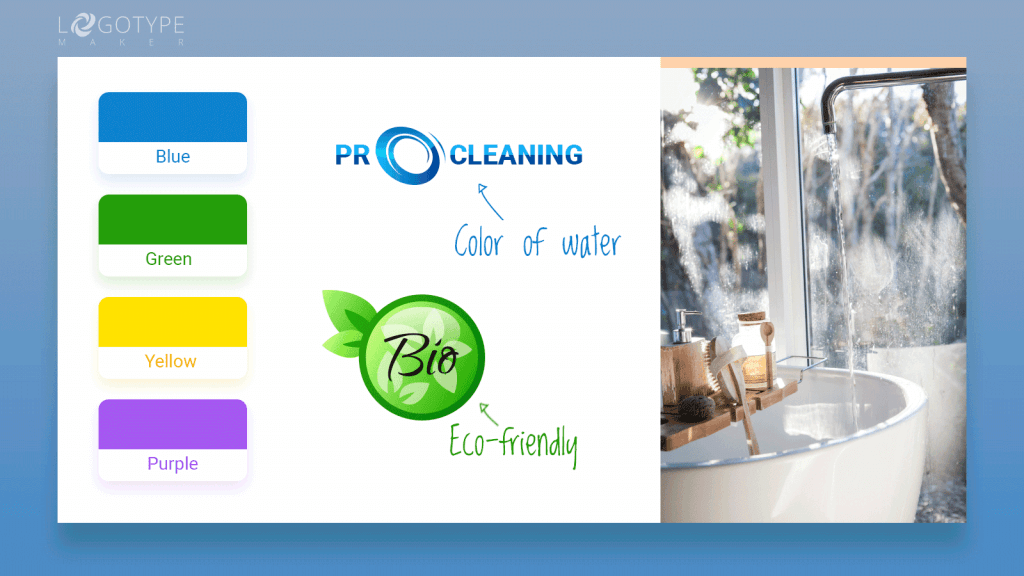
All of the above are great options but if you want your business to stand out, mix green with purple, grey or pink. Just remember to keep the color scheme consistent. Pick either cool or warm tones.
Cleaning business logo can also benefit from all of the combos listed above. You can also go for a two-color negative space logo pairing white with blue (the color of water), green or yellow. Be careful with grey and deep dark colors as those may evoke associations with dirt and gloom and that’s the opposite of what you want.
Photo
As a person, who loves the art of photography, you probably already know which colors create matches made in heaven. But what’s interesting about the photo business logos, most of the top artists and studios prefer to stick to safe choices like black and white or black, white and red. Most of the artists and studios neglect colored background and other bold choices.
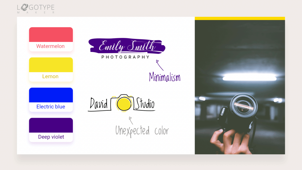
Sure, minimalism is one of the most influential design trends nowadays but thinking outside the box has never been a bad thing either.
Pick two or three colors that will make your photo brand different and unique. Go for unexpected like platinum, watermelon, and hot pink; black and electric blue; lemon yellow and deep violet.
Remember, your creativity is your brand’s greatest asset. Nobody wants to hire a generic photo artist. So go ahead and experiment with the color, creating a striking memorable logo everyone will be mesmerized with!
Choosing the right color scheme for a business logo can become a real challenge. You may go for one combo today and then completely change your mind tomorrow. Fortunately, all our users have an opportunity to save the unlimited amount of drafts in their profiles. So don’t be afraid to try something new and daring! You can paint your business the brightest future!
More about logo colors to compliment your brand from Printi!